How a new HTML element will make the Web faster (Part 2)
- Diem Do
Part 1
Introducing the picture element
The Picture element story begins with the developers working on the Boston Globe, including Mat Marquis, who would eventually co-author the HTML specification.
In the beginning, though, no one working on the project was thinking about creating new HTML elements. Marquis and the other developers just wanted to build a site that loaded faster on mobile devices.
As Marquis explains, they thought they had a solution. “We started with an image for mobile and then selectively enhanced it up from there. It was a hack using cookies and JavaScript. It worked up until about a week before the site launched.”
Around this time, both Firefox and Chrome were updating their prefetching capabilities, and the new image prefetching tools broke the method used on the Globe prototypes. Browser prefetching turned out to be more than just a problem for the original Globe solution; it’s actually the crux of what’s so difficult about responsive images.
When a server sends a page to your browser, the browser first downloads all the HTML on the page and then parses it. Or at least that’s what used to happen. Modern Web browsers attempt to speed up page load times by downloading images before parsing the page’s body. The browser starts downloading the image long before it knows where that image will be in the page layout or how big it will need to be.
This is simultaneously a very good thing—it means images load faster—and a very tricky thing. It means using JavaScript to manipulate images can actually slow down your page even when your JavaScript is trying to load smaller images (because you end up fighting the prefetcher and downloading two images).
Marquis and the rest of the developers working on the site had to scrap their original plan and go back to the drawing board. “We started trying to hash out some solution that we could use going forward… but nothing really materialized.” However, they started writing about the problem, and other developers joined the conversation. They quickly learned they were not alone in struggling with responsive images.
“By this time,” Marquis says, “we have 10 or 15 developers, and nobody has come up with anything.”
The Globe site ended up launched with no solution. Mobile devices were stuck downloading huge images.
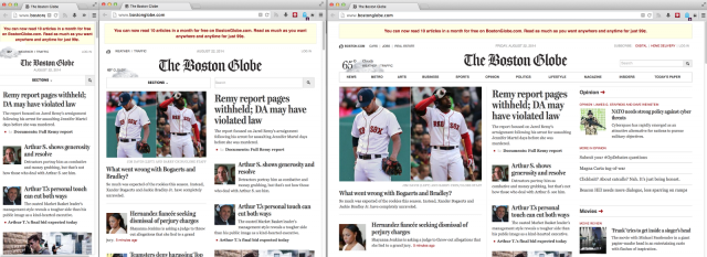
The Boston Globe website at phone, tablet, and desktop sizes.
Soon other prominent developers outside the Globe project started to weigh in with solutions, including Google’s Paul Irish and Opera’s Bruce Lawson. But no one was able to craft a solution that covered all the possible use cases developers identified.
“We soon realized,” says Marquis, “that, even if we were able to solve this with a clever bit of JavaScript, we would be working around browser-level optimizations rather than working with them.” In other words, using JavaScript meant fighting the browser’s built-in image prefetching.
Talk soon moved to lower-level solutions, including a new HTML element that might somehow get around the image prefetching problems in a way that JavaScript never would. It was Bruce Lawson of Opera who first suggested that a new <picture> element might be in order. Though they did not know it at the time, a picture element had been proposed once before, but it never went anywhere.
Part 3
Source : arstechnica.com